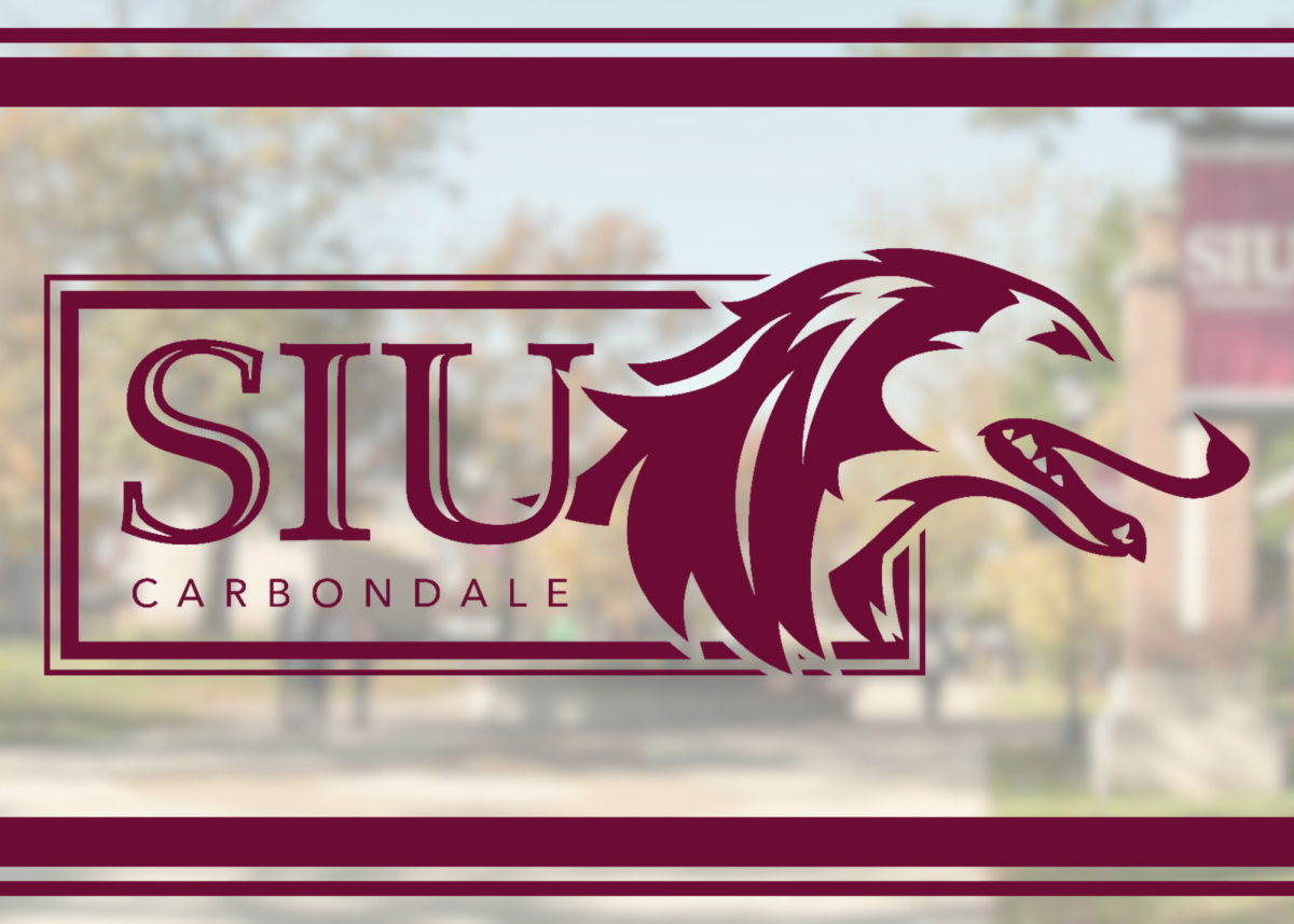
You may have noticed a different look on banners across campus and billboards — the logo for Southern Illinois University Carbondale now incorporates elements of the university’s academic logo with the doghead of Saluki athletics. Today the university continues to further unify its brand with an update of its stationery system and soon new email signatures.
“Our logo showcases our proud history, first-class academics, premier research, and the excitement, energy and enthusiasm of student life and Saluki athletics,” said Jeff Harmon, SIU Carbondale’s chief marketing and communications officer. “It fits well with our Imagine 2030 strategic plan, especially the pillar to refine SIU Carbondale’s brand and increase our visibility in the Southern Illinois region and beyond.”
Harmon said efforts to enhance the SIU Carbondale brand will continue, in consultation with stakeholders in the Saluki family.
Advertisement
“When people think about branding, the logo and colors come to mind first, but a brand is so much more than that,” he said. “A brand is about our identity and reputation. SIU Carbondale has so much going for it. We want our brand to capture that.”
University Communications and Marketing conducted a soft launch of the modified logo in the past few months as it updated marketing and promotional materials. Colleges, schools and other university units can request the updated logo in their identifiers by filling out the Request for SIU Carbondale Identifier Form. They can also order stationery and business cards with the logo. In a few days, a new email signature generator will be launched.
Advertisement


Kevin Ford • Sep 11, 2023 at 11:24 am
SIU has over the decades many very good logos for example the SIU “Dot” used from the 1960’s to early 2000’s and terrible ones like that SIU in big and little letters with a “sunrise” over the BIG I. It can unfortunately still be seen in tile flooring at the Student Center. After that disaster SIU went back to a truly elegant, well designed logo that could be showed with pride. Now it’s once again being replaced with a bastard “design” that looks like a five year old produced. This is now a Carnegie level 5 university’s IMAGE!! SIU keeps trying to find it’s identity that it lost with low enrollment, loss of state funding, and a once in a century pandemic. I totally understand grappling for a new image many major corporations change logs ALOT before they go into bankruptcy and eventually disappear from memory much like SIU is at this point. The new logo is UGLY no other words it replaced a well designed image with something childish. It’s not going to bring in more students or money from Springfield. The architect Edward Durrell Stone once said “Sometimes controversial things aren’t so controversial, there just plain ugly” just like this terrible logo, Administration please don’t do this!!!!